Designing The Future Of Intelligent Search
What we knew: search on mobile devices was broken. Desktop search had made its way onto our tiny devices but hadn't been reimagined for them. What we hoped for: intelligent Search 2.0 tailored for mobile, powered by AI. We wanted the future of search to be able to understand human language in a way that enabled it to refine, pivot, negate, and deduce as a real human would in conversation. And we wanted the results it generated to be precise, succinct, and relevant (no more ten blue links). Through a combination of raw knowledge, intent understanding, and intelligent conversational back and forth, Ozlo aims to realize the future of AI for everyone.
UX Design & Testing
The first task after joining Ozlo was to explore and define what exactly Ozlo was going to be. Countless hours were spent scribbling on whiteboards and in sketchbooks, trying to understand user needs and their motivations. We generated flows, information architectures, and blueprint systems as we explored the possible solutions before us, striving for a simple, intuitive, and wholistic user experience with clear goals. With each new iteration, we tested and gathered user feedback to push us forward as quickly as possible. Never afraid to begin again, Ozlo was in constant forward motion, ever evolving.
Systems Design
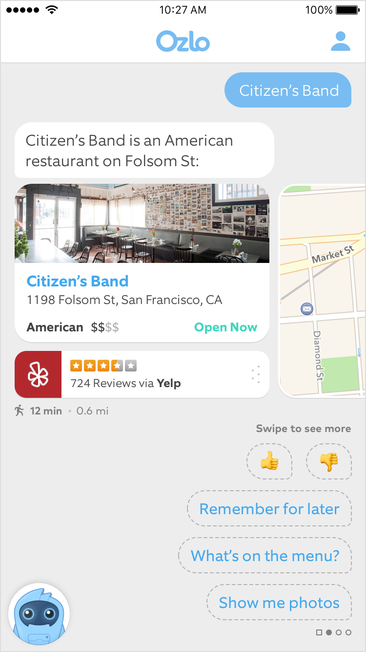
We knew that whatever shape Ozlo took, it had to be modular and scalable. As we developed the UX, significant effort was put into thinking holistically about the system that would support the experience, both in its design and development. For each manifestation of the product we generated modular blueprint systems for both the visuals and the dialogue (a core part of the experience). We strove for consistency and usability, developing simple and intuitive interaction, UI, and dialogue patterns that could be reused and expanded.
Interaction Design
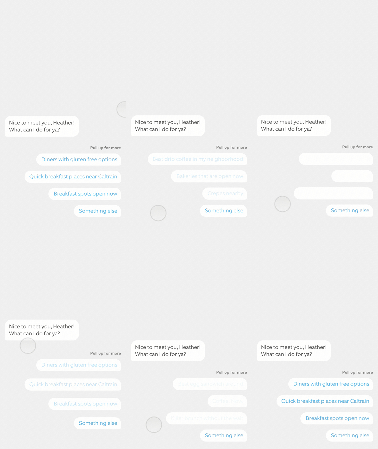
To fuel discussions, decision making, explore possibilities, user test ideas rapidly, and speed up development, I spent many hours developing both lo-fi and high-fi mockups of Ozlo interactions. Seeing the animations on a laptop screen wasn't good enough, some interactions needed to be felt to be evaluated. Everything from core, user-feedback alert notifications to complex multi-thread transitions and messaging chat bubble behaviors was prototyped and played with in context, on the phone. Striving to understand the limitations of (and push the boundaries of) what was possible, I worked side by side with our engineers, tweaking and retooling interactions as needed to arrive at the very best solution we could ship.
Visual UI Design
What would a great consumer product be without pixel perfect visual design? From detailed spec writing to asset cutting, I crafted fully polished visual designs and ushered them through engineering, making sure each design was implemented as closely to spec as possible.
Character Design & Branding
When designing the character that would become Ozlo himself, we were not trying to create the next super human, we were creating a robot that we hoped would one day be able to understand and perform a multitude of tasks faster and more effectively than your real life best friend. After many sketches and mockups we decided to move forward with one of my initial sketches. I had the delight of illustrating and animating the new face of Ozlo and his many expressions. Our new little AI sidekick appears in product as a tappable avatar that occupies the lower left hand of the screen. Only there when you need him, gone when you don’t, but always at the ready to keep the conversation going.
Marketing and Promotional Materials
In addition to working holistically on the iOS product, I also helped craft Ozlo's corporate desktop and mobile web experience, marketing and partner materials, and presentation themes and pitch decks.


